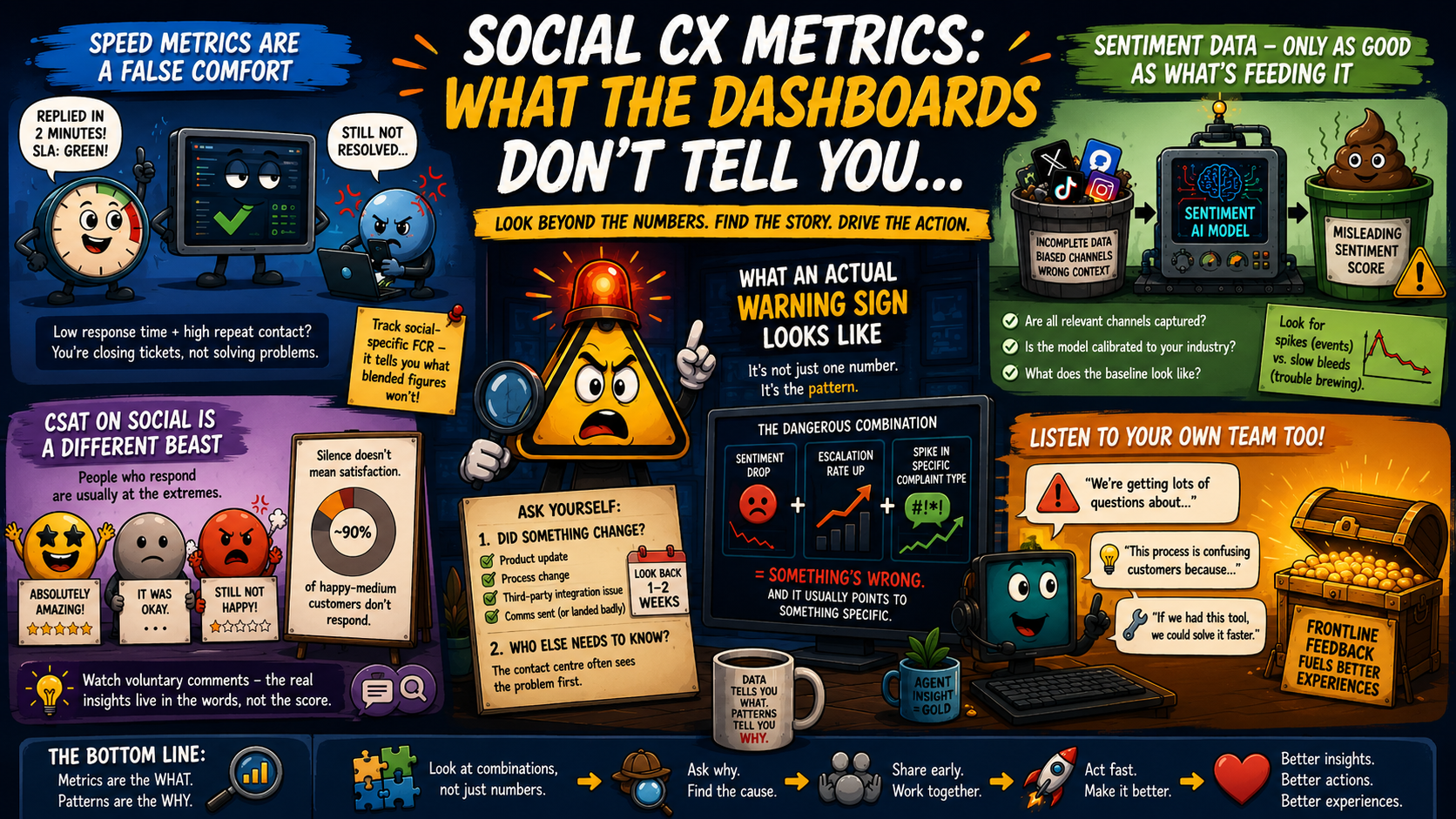
#tech-nugget – Social CX metrics – what the dashboards don’t tell you…
Disclosure: All information is accurate at the time of writing this article, things change, we change,
vendors change (and we all love them for it)… take everything with a pinch of salt, if you like salt…
You also might spot some AI generated images using Copilot, it’s so fun to use, how can I not do that….
And I use Grammarly to refine my typing, it’s not re-written but checked so I don’t make a fool of myself, it does happen often!
A piece from the Contact Centre Summit recently circulated, covering the new social CX metrics that contact centres should track from 2026 onwards.
Worth a read if you haven’t seen it. It covers the right ground – sentiment analysis, social listening, response quality over response speed, and feeding insight back into operations.
https://contactcentresummit.co.uk/briefing/social-media-month-the-new-metrics-contact-centres-should-be-tracking-in-2026/
But it does what a lot of these overview articles do: it tells you what to measure and then leaves you there. The harder bit to write (and the bit that actually matters when you’re sitting in front of a dashboard at 9am trying to work out if something’s wrong, my usual day…) is what you’re looking for when those numbers move, and what they’re usually trying to tell you.
So here’s some extra waffle on that, I’ve just taken the headlines and gone into a little bit of depth, and we all know, I LOVE waffles (both kinds)…
Also, I’ve made some really fun AI-generated images to go with these; everyone seems to be doing it. I had to put them in as they looked great and my kids found them hilarious – just go with it!
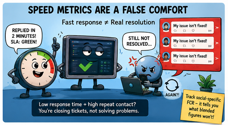
Response time is where everyone starts because it’s clean, easy to report, and looks good on a slide. And yes, it matters. Nobody wants to sit on X (still calling it Twitter in my head…) waiting three hours for a reply.
The problem is that a fast response and an actual resolution are two completely different things, and it’s easy to hit your SLA on one while quietly failing at the other.
The red flag I look for is low response time combined with high repeat contact on the same issue. If you’re replying quickly but the same complaint keeps coming back from the same customer, or the same type of complaint keeps surfacing week on week, the speed metric is doing nothing but masking a resolution problem. The ticket is closed. The customer is still annoyed. The dashboard is green.
Social-specific first contact resolution is worth pulling out separately from your overall FCR (First call resolution) figure. Social interactions often catch edge cases and customers who have already tried another channel and had issues that weren’t resolved. The FCR number on social inbounds tends to tell you something your blended figures won’t. – Separation is key!
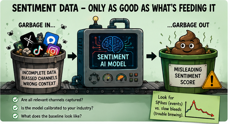
I’m a big fan of this new dataset; it’s really in-depth about what you can get from a system. Sentiment analytics tools have come a long way, and some of them are genuinely good. But there’s a tendency to trust the output without ever questioning the input, and that’s where things go a bit off-piste (I think that’s a French word?).
Before putting any real weight on a sentiment score, it’s worth asking: is the platform actually capturing all the relevant channels, or is it weighted towards the ones that are easiest to monitor? Is the model calibrated to your industry and specific product language, or is it a generic setup that’s likely to misread sector-specific terminology? And what does the baseline actually look like, because a sentiment score without a meaningful baseline is just a number with no context.
Personal take: I’ve seen sentiment dashboards that look healthy until you realise they’re only pulling from one or two channels and missing a whole stream of activity elsewhere. The tool isn’t lying. It just doesn’t know what it isn’t seeing – expand the horizon and make sure you’re looking at the right places, not just what one department thinks they need.
Garbage in, garbage out. As true here as anywhere.
The other thing worth separating is a sudden sentiment spike versus a slow sentiment bleed. A spike usually points to something specific: an outage, a product issue, a policy change that landed badly. A slow bleed is often more dangerous because it doesn’t trigger any alerts. It just disappears, quietly, week by week, until it’s already become a real problem by the time someone notices. If you’re only looking at weekly snapshots, you can miss the trend entirely. – Something I live by outside of work too 🙂
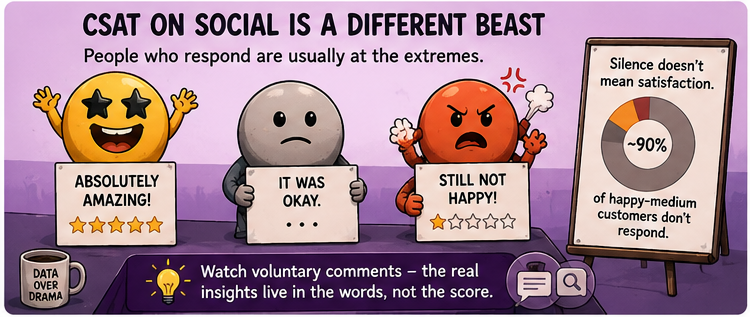
Something that doesn’t get said enough: the customers who respond to CSAT surveys on social are almost always at one of the two extremes. Genuinely delighted, or still not happy. The middle ground, the majority who had a perfectly adequate interaction and got on with their day, mostly don’t bother.
This is also one of the hardest thngs to try to capture in any modern day feedback, digital or otherwise, we as humans do not like to waste time, espeically in the busy lives we lead (I know that for sure) and the last thing we want to do is fill out a scoring form, the only time you will get personal bias is when it’s negative, which in itself is another stat – hooray.
That response skew matters more than people realise. It means your CSAT score on social can sit completely flat even when the average quality of interactions is drifting downwards. A stable score isn’t always good news. It might just mean the same proportion of extremes is responding each month, while everyone else’s experience is slowly getting worse.
What I’d actually watch alongside CSAT is voluntary feedback, the comments left without prompting. These tend to be more honest and more specific, and the patterns in the language are usually more useful than the number itself. If you start seeing the same phrases or the same type of frustration appearing repeatedly in unprompted comments, pay attention to that before you look at the score.
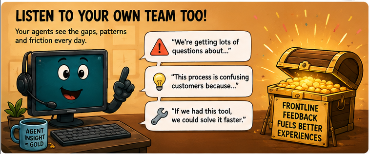
Also, just to whack on the end here as I’m 2 coffees into waiting for my daughter’s gym to finish, for me it’s not just the feedback from the customers, your own Agents can be a great source of information when it comes to quality, their feedback is just as important as well as who’s on the other end of a modality – trust them!

Repeat complaint trends and escalation frequency. They’re almost always in the weekly report, they get acknowledged, and then nothing happens with them. Which is a shame, because these are the two that most clearly point at problems the contact centre didn’t cause and genuinely can’t fix.
A consistent pattern of repeated complaints about delivery times isn’t a contact centre problem. It’s a logistics problem. A recurring spike in billing escalations isn’t a training issue; it’s a process or systems issue somewhere upstream. The contact centre is just where the customer ends up when something else has already gone wrong.
If that data isn’t being fed back into the right places (operations, product, finance, wherever the actual cause sits), then it’s being wasted. You’re sitting on useful operational intelligence and using it only to report on your own team’s performance, rather than to fix the thing that keeps generating the complaints.
This is probably one of the biggest problems I see, we have access to all this information, but it sits on someone’s desk, inbox or an Excel to be read and acted upon.
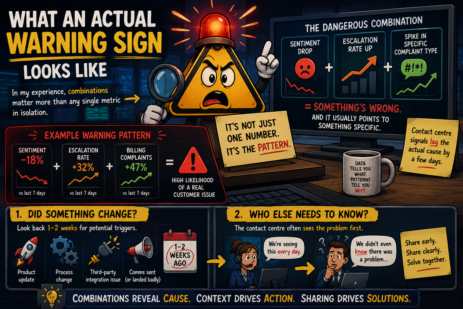
In my experience, combinations matter more than any single metric in isolation. A sentiment drop on its own might just be noise. A sentiment drop alongside a rise in the escalation rate and a spike in a specific complaint type: that’s a pattern, and it usually points to something specific.
The first question I ask when I see a combination like that is, did something change? A product update, a process change, a third-party integration that started behaving differently, a comms that went out and landed badly. Contact centre signals tend to lag the actual cause by a few days, so whatever triggered it usually occurred a week or two before the metrics began to move.
The second question is: who else needs to know this? Because often the contact centre team is already sitting on the answer to a problem that another team is still trying to diagnose.
The tools are better than they’ve ever been. The data is richer. The dashboards are prettier. But the gap between a well-configured reporting setup and actually understanding what your customers are experiencing remains pretty wide, and it doesn’t close on its own.
The metrics in the Contact Centre Summit piece are all worth tracking. I’m not arguing with the list. What needs more attention is what you’re looking for when you look at them, who owns the decision when something moves, and what the plan is when the numbers start telling you something isn’t right.
Dashboards surface the signal. Someone still has to decide what it means – I genuinely re-wrote this one 7 times to try to make it sound useful – how did I do?
Cheers!
Ben